Home Grid
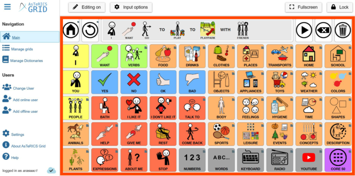
The Home Grid is a board made up of cells in which we will insert our pictograms, images, texts, etc., to facilitate functional communication to our user. Tablero de comunicación inicial es una cuadrícula compuesta por celdas en las que iremos insertando nuestros pictogramas, imágenes, textos, etc., para facilitar la comunicación funcional a nuestro usuario/a.
From this grid, we can use linked grids with different vocabulary categories to enrich communication.
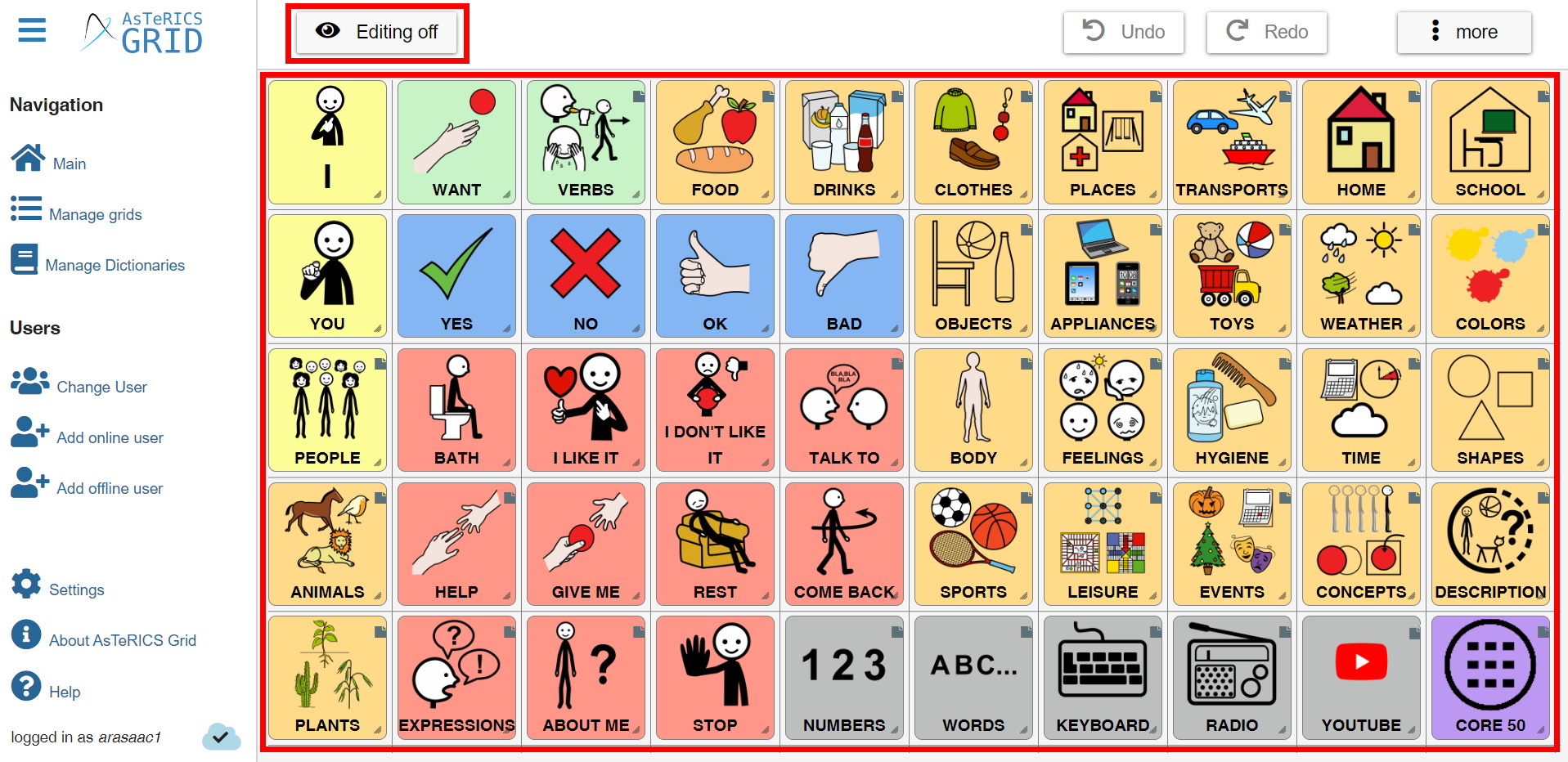
To edit our main communication grid, we have to click on the Edit button in the top menu.

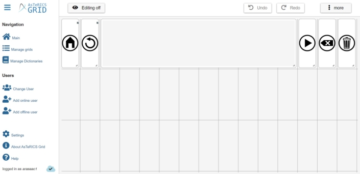
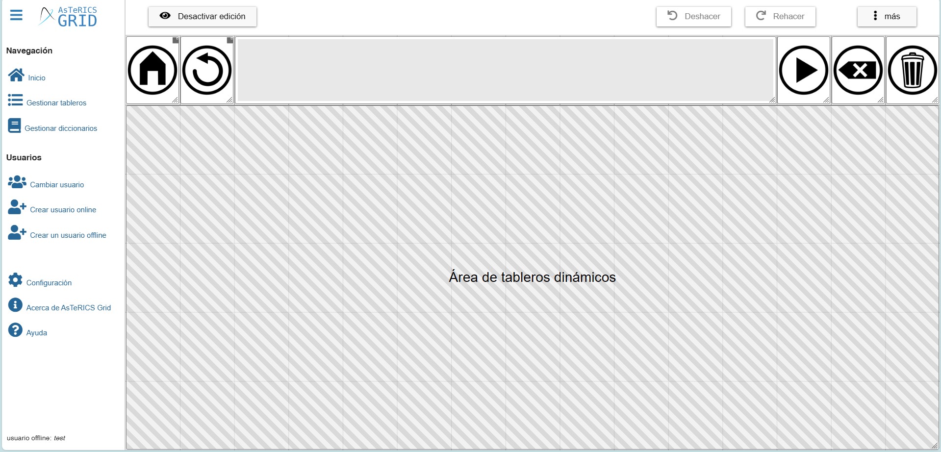
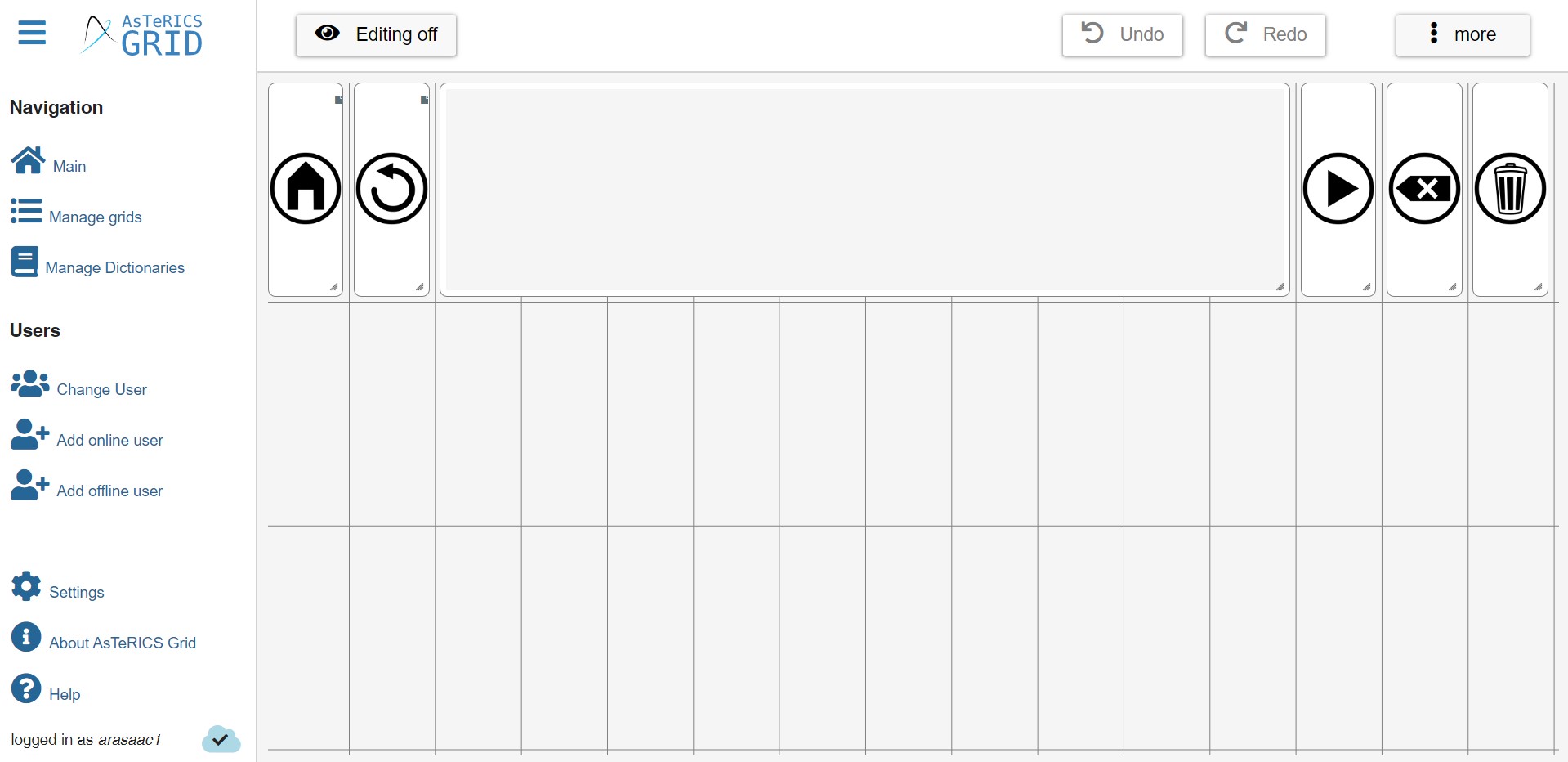
If we edit the communicator we are using as an example during these tutorials, the following screen will appear:

We can see that, where the Edit button used to appear, a new button called Editing off appears. Once you have created or modified your grid, click on it to return to the previous mode.
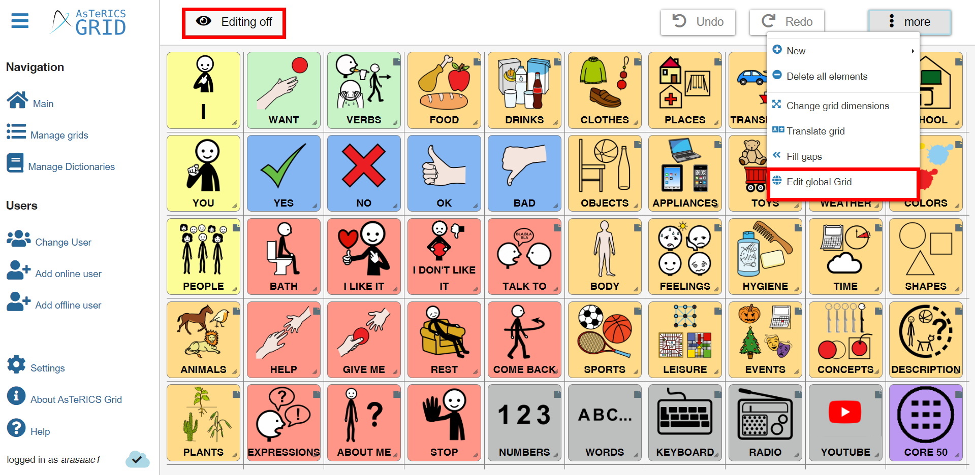
We can also see that the cumulative phrase row and action buttons have disappeared. These elements are inserted within the Global grid.
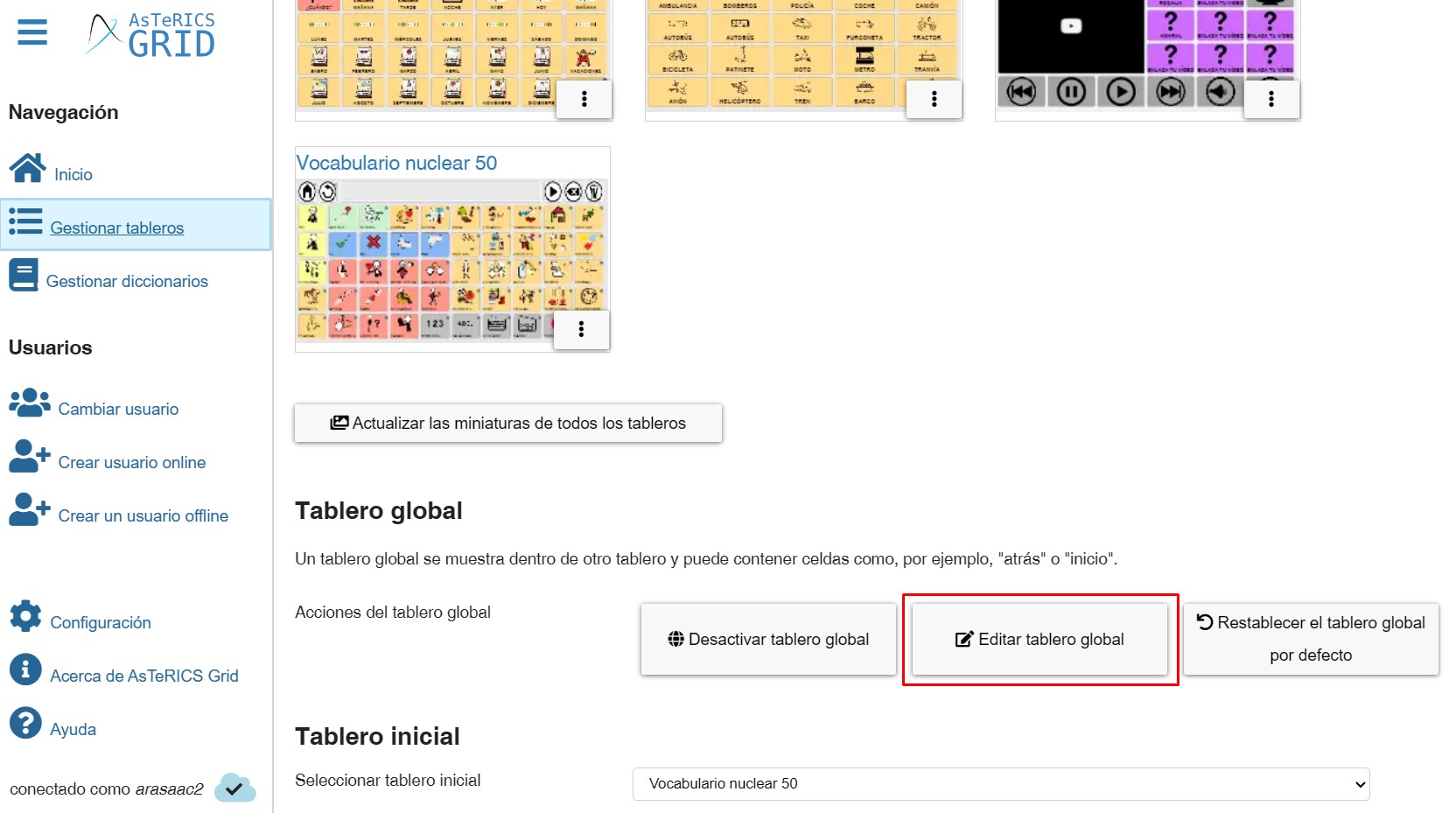
To define which will be our initial board, which will affect cells such as Home (in the global board) and options such as Navigate to Home Grid that we will see when we explain the Navigate to another board action, it is important that in the Manage Boards section we go to the bottom and in the Home Grid section we define in the drop-down menu which board we want to be from among those we have created.

At any time we can change the home grid by selecting any of our list of grids. Once selected, all links in our communicator pointing to the home grid will be automatically updated to point to the newly selected grid.
Optionally we can activate the option “Navigate to home grid after selecting an item”. Once activated, the system will automatically return to the initial dashboard that has been configured when, when accessing a linked dashboard, we click on a cell that does not link to other dashboards.


