AsTeRICS Grid Dynamic Communicator
16 – Global Grid and Cumulative Phrase
WHAT IS THE GLOBAL GRID?
The Global Grid is a static board visible on all communication boards. In other words, unlike the other dynamic boards in the communicator that change as you navigate, the content of the Global Board always remains static in the same unchanging position.
The global grid can contain any type of cell: accumulated phrases, action buttons (e.g., start, read phrase, delete, change language, etc.), real-time information cells, and, of course, basic or core vocabulary that we want to be visible at any time. All elements placed on this global board, regardless of their position, will appear on all communication boards located in the same place, as we will see when editing and configuring it.
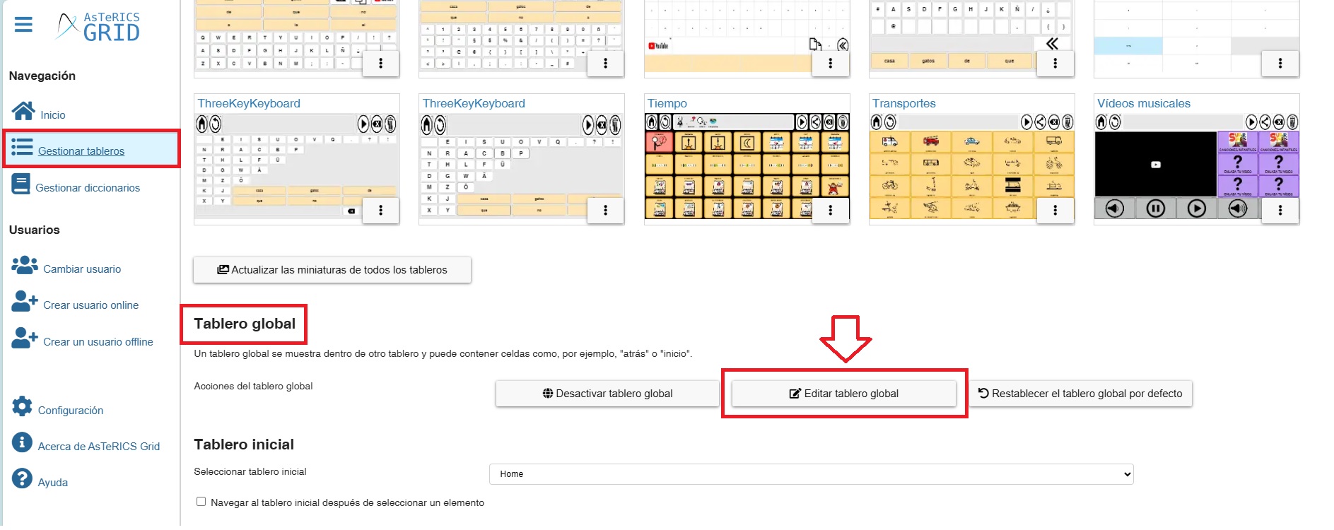
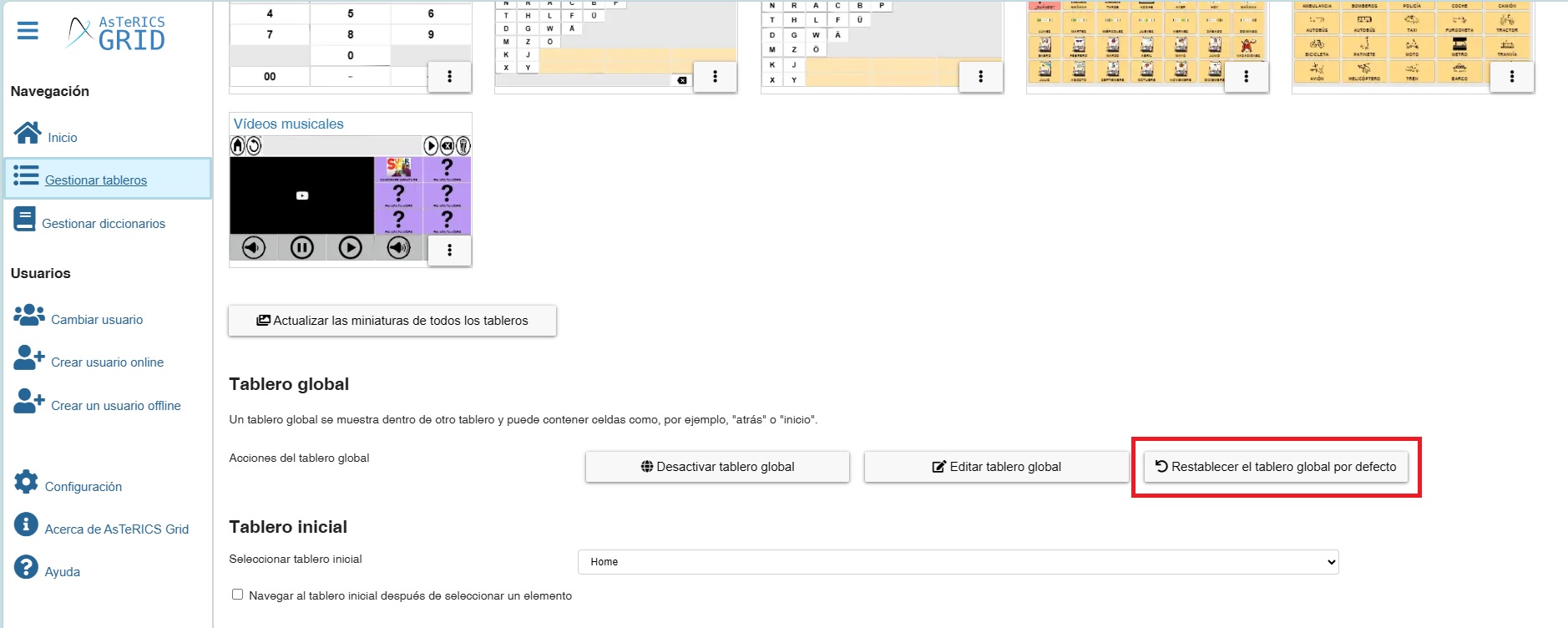
Before we continue, we should know that the Global Grid can be Activated / Deactivated from the Manage Grids section. We can also Reset the global grid when we have made changes to it and want to return it to its original state (with the phrase strip and the buttons for home, back, read phrase, delete, and the dynamic boards area) and Edit it.
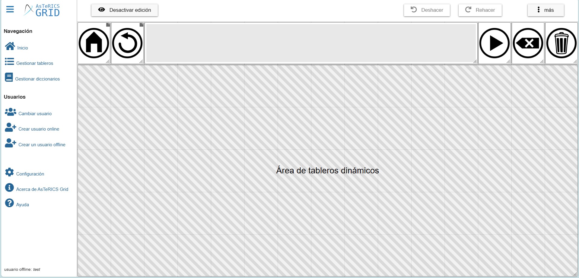
At the bottom of Manage grids, you will find a section called Global grid with all these options.
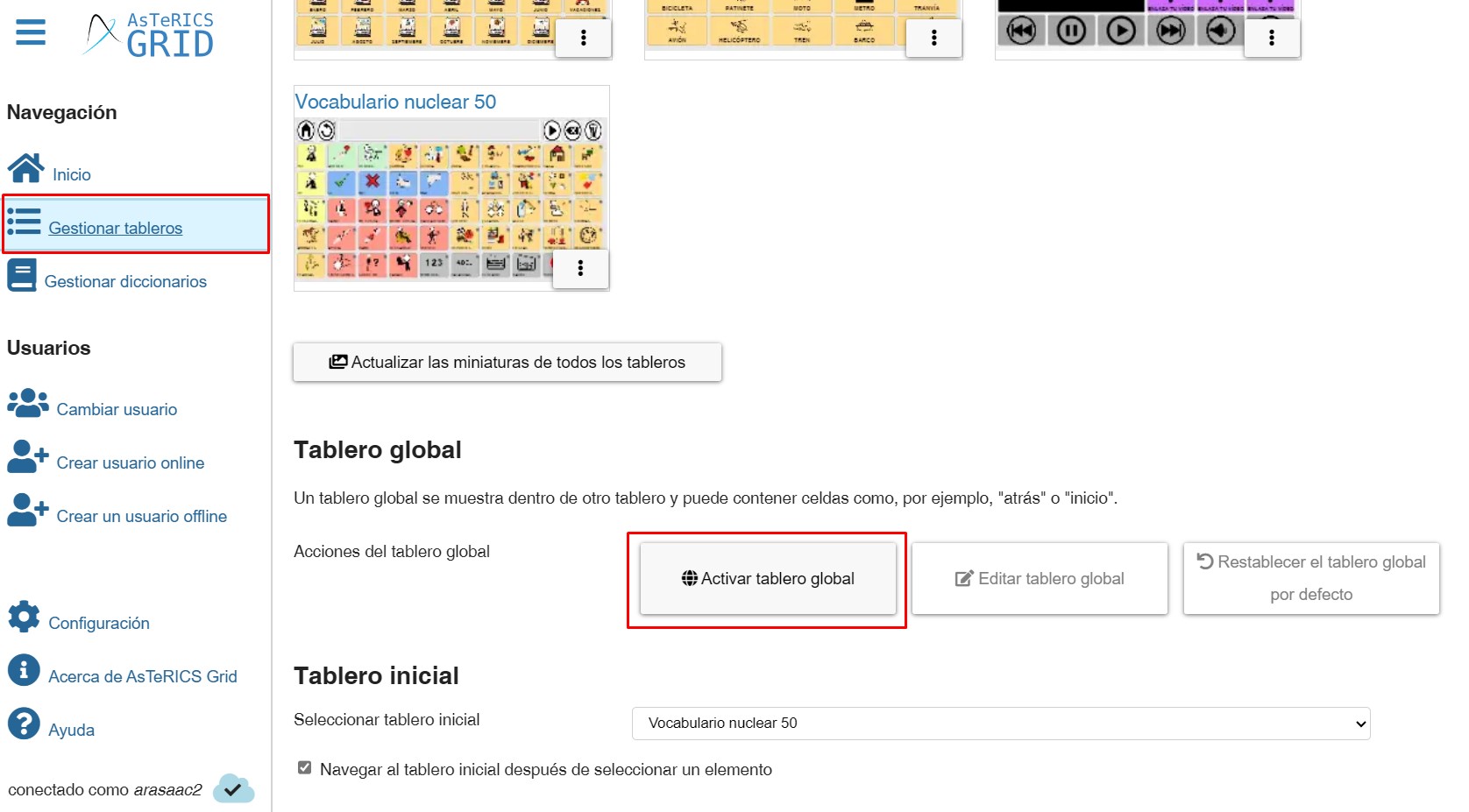
(TRICK) Sometimes our global dashboard becomes deactivated for no apparent reason, causing us to stop seeing the accumulated phrases and buttons like Home, Back, Delete, etc. In these cases, simply go to this section in Manage Dashboards and click on the Activate Global grid button, as shown in the screenshot above.
In this chapter, we will show you how to add and manage the Dynamic Boards area and the possibilities it offers for creating different designs and templates of communicators and, on the other hand, how to add the accumulated phrase and the action buttons for this phrase.
EDIT GLOBAL GRID
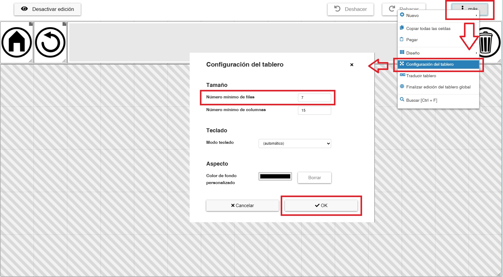
To edit our global dashboard, we have two options. The first is to click the Edit global grid button within the Global Grid section of the Manage Grids page.
The other option is, from the editing of a board, to click on the More menu at the top and there select Edit global grid.
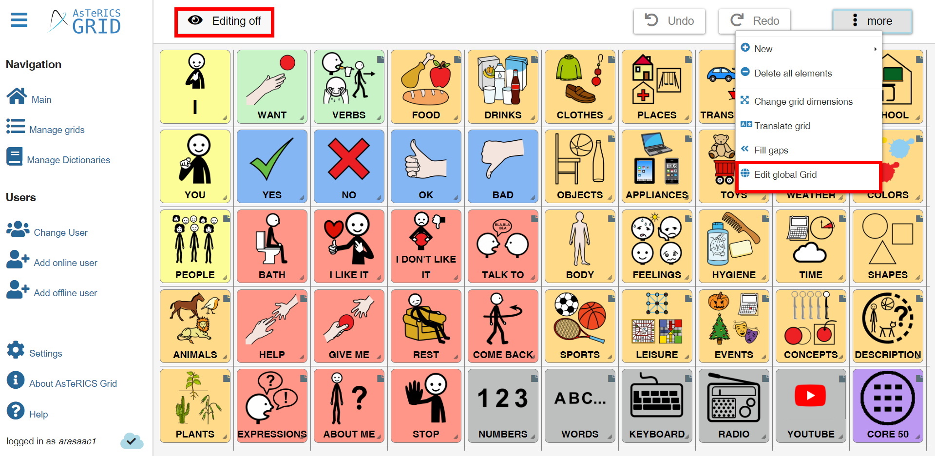
The Global Grid of the current communicator will then appear on the screen.
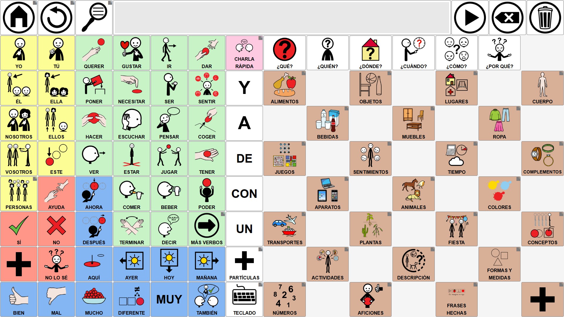
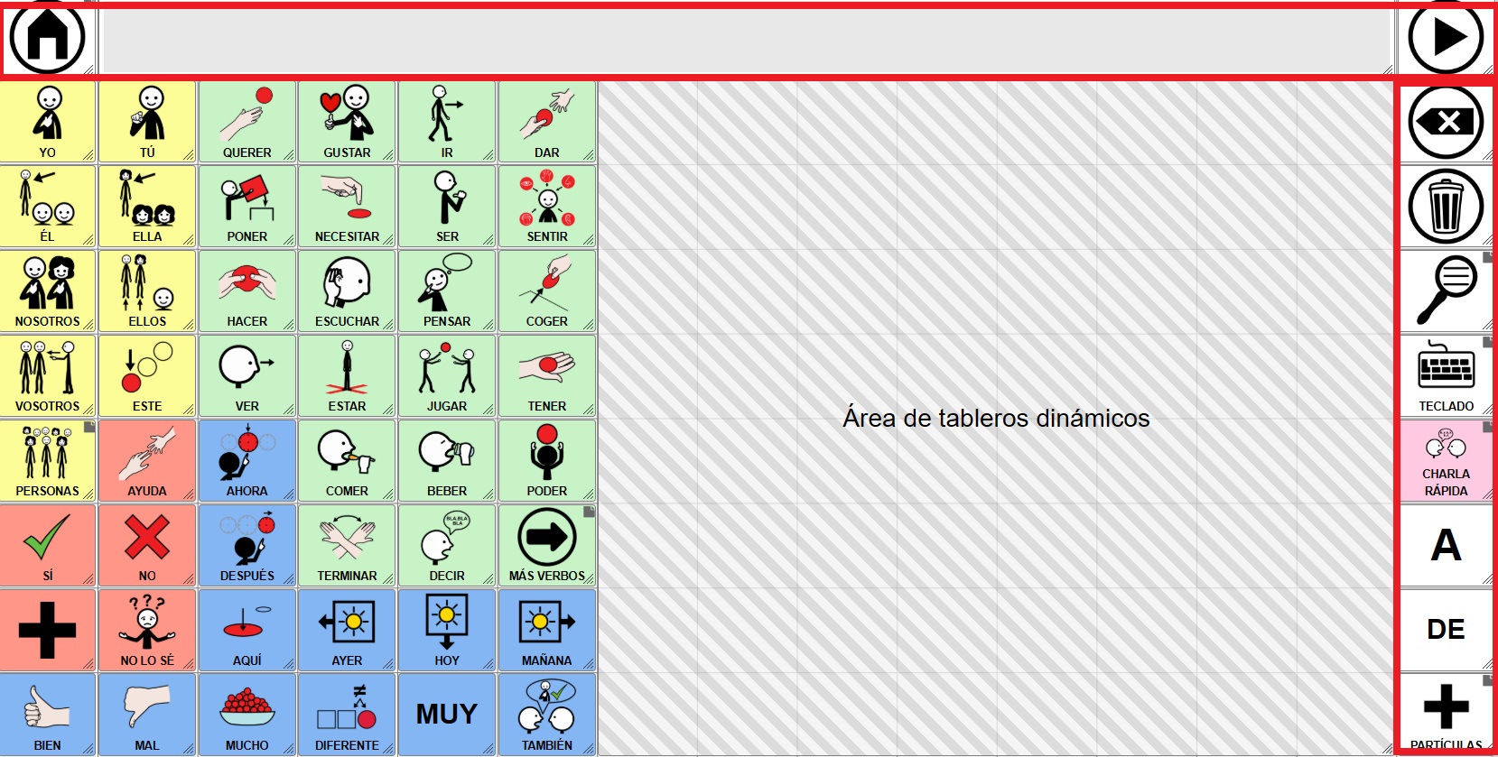
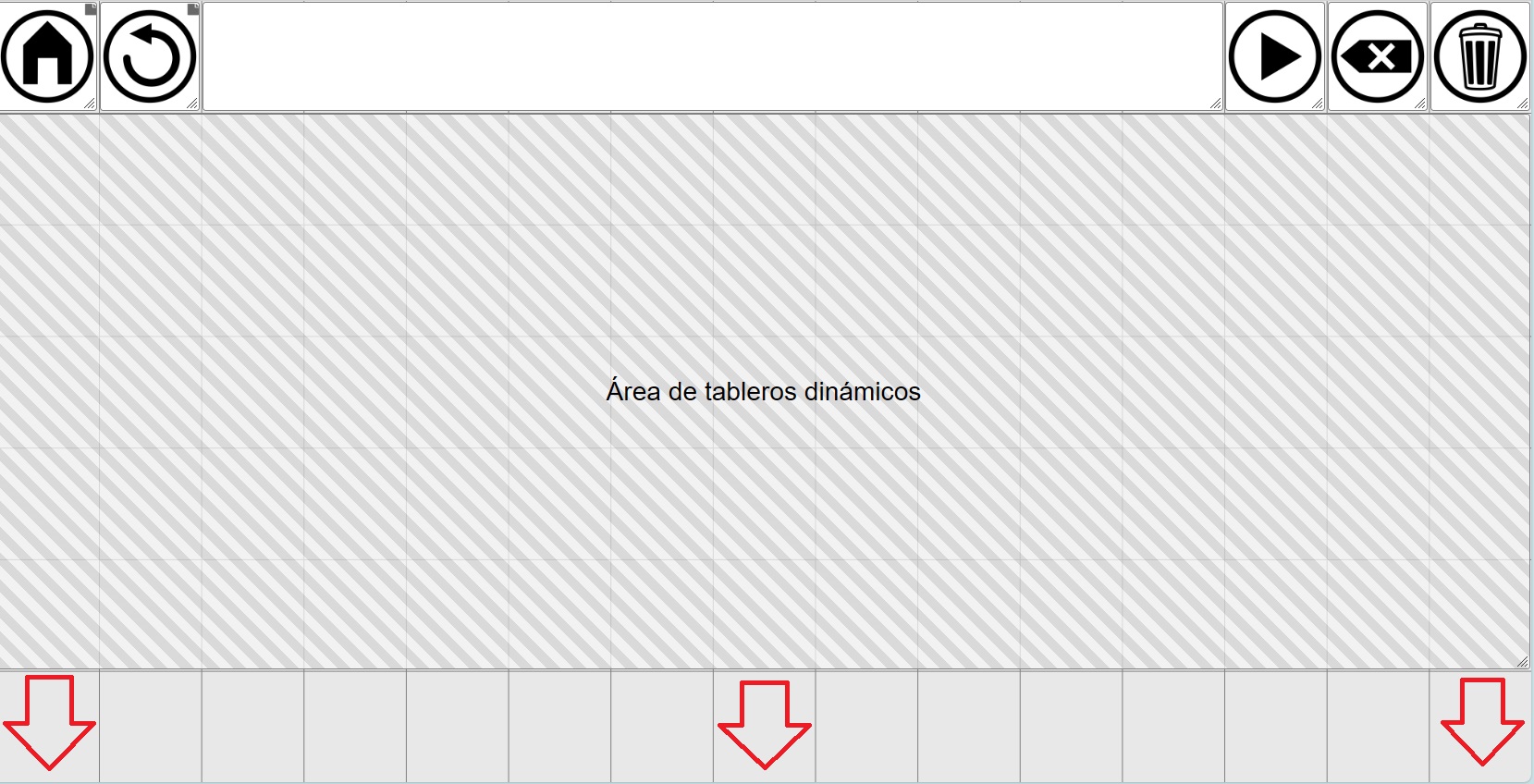
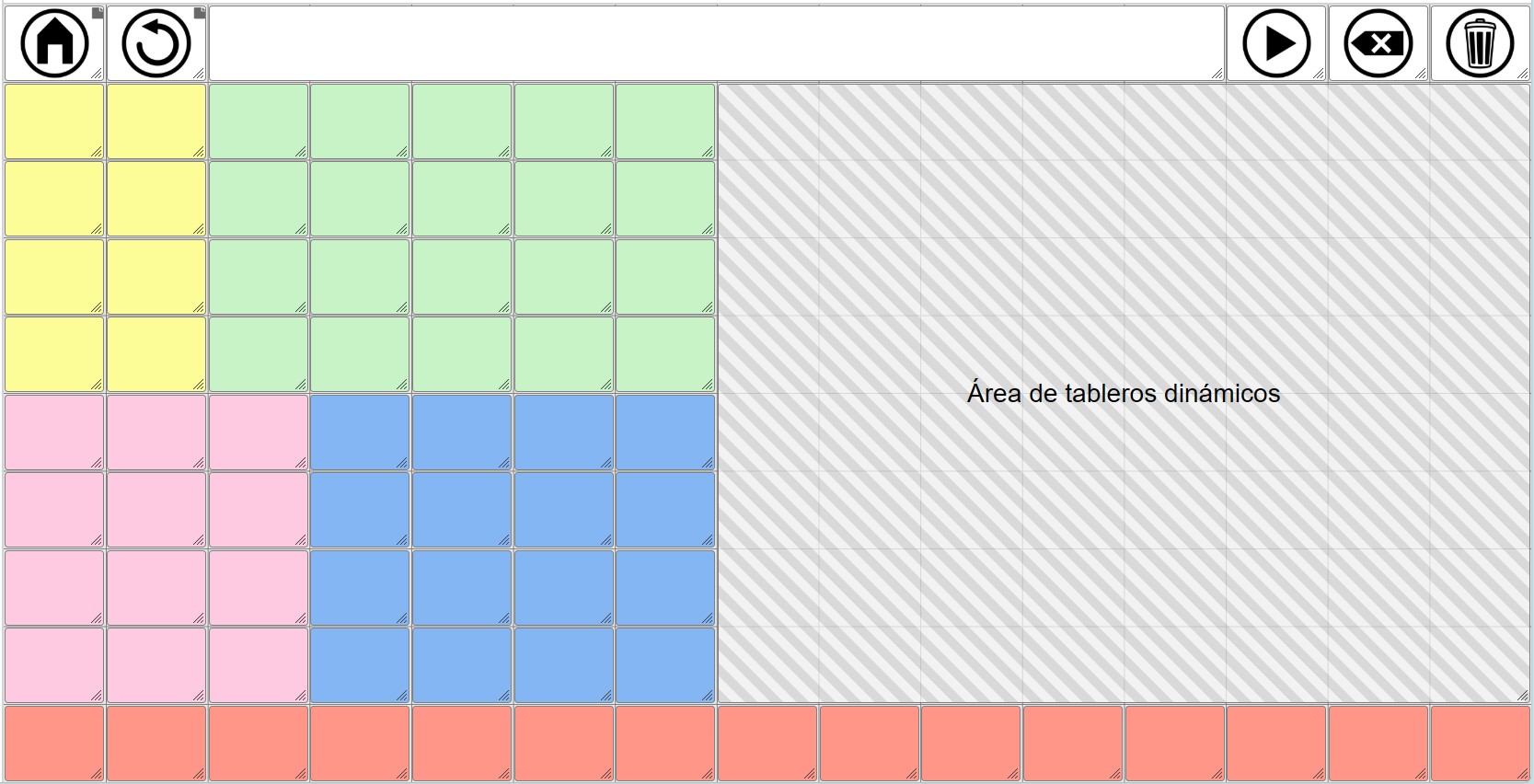
The default global grid is shown below. This board, with 6 rows and 15 columns, places the accumulated phrase and various action buttons (read phrase, delete, start, etc.) in the first row, and a dynamic board area occupies the remaining rows. We will now explain what this dynamic placeholder is, how to create it, and how to manage it.
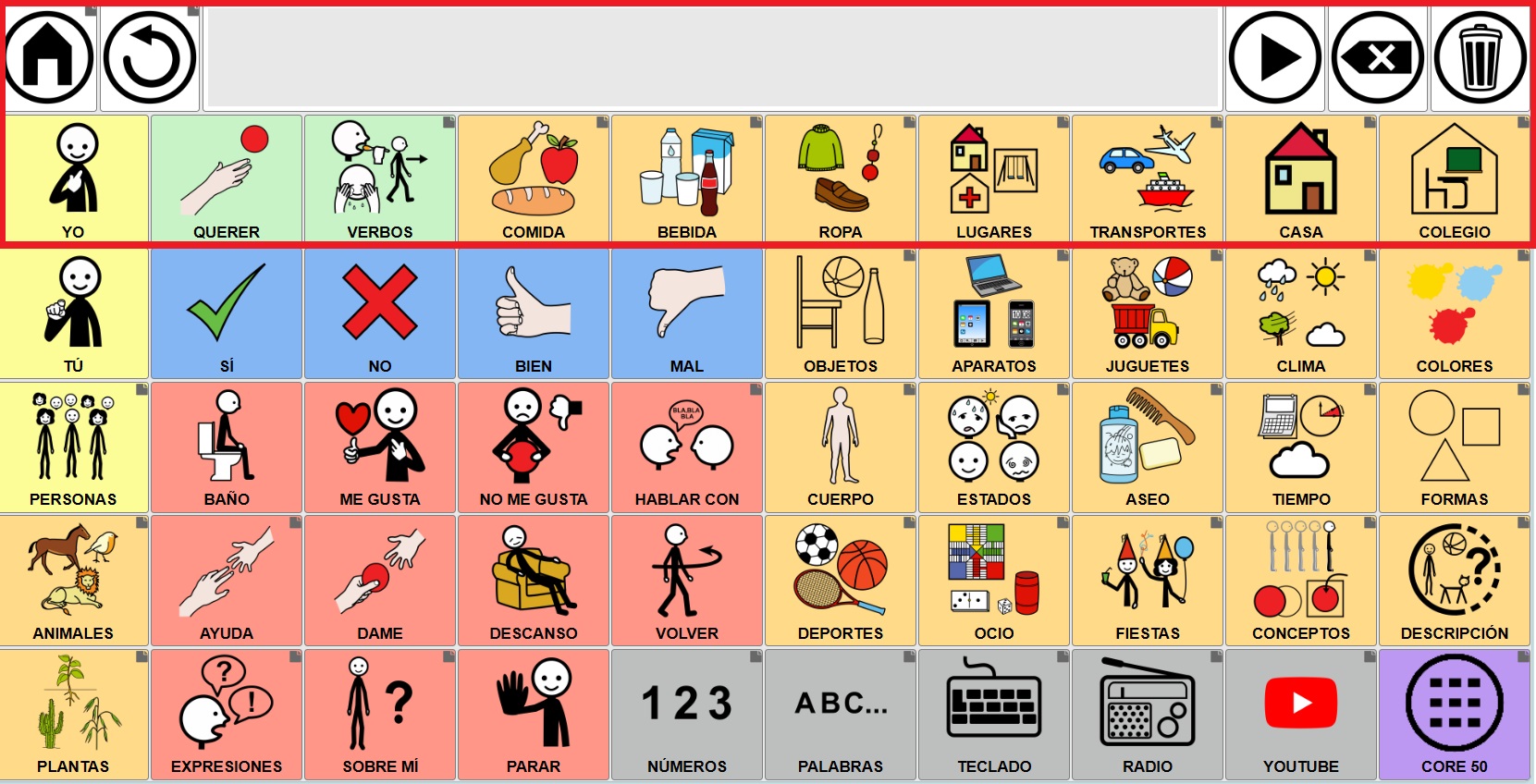
If, when creating a user account in Asterics, we start from a communicator model like this (ARASAAC Global Grid Core Communicator)…
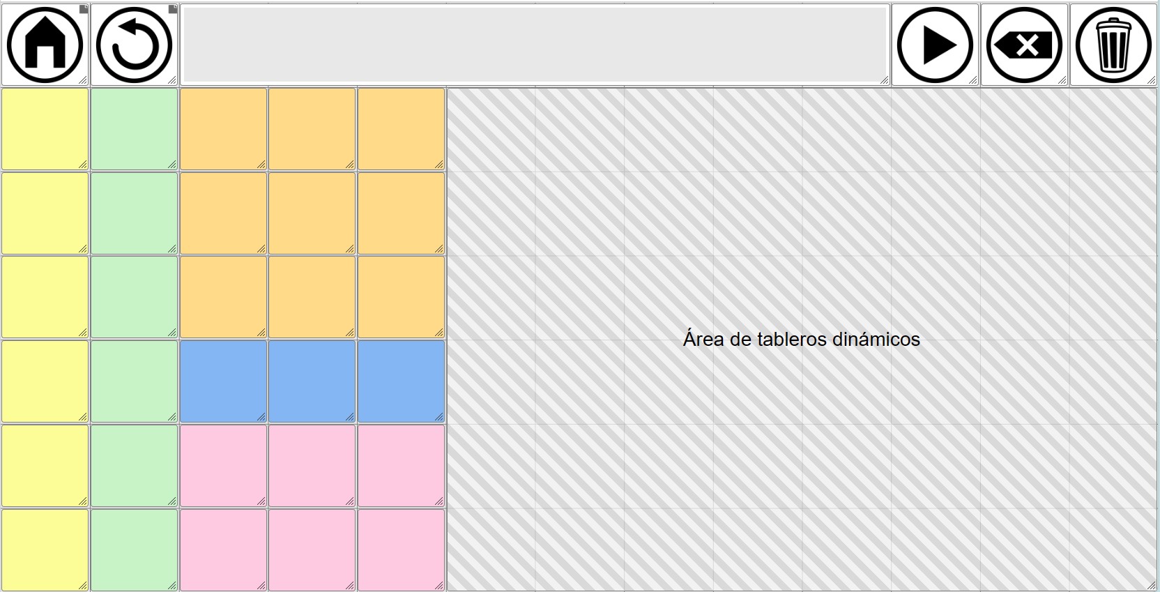
…when editing the global grid we will see that the Dynamic grids placeholder only occupies the right side of the communicator.
Finally, if we have a communicator created before January 2026, when the Dynamic Grid Area was introduced, or if we delete this area, we can have a global grid without this area, as shown in this screenshot. Next, we’ll see how to add the Dynamic Grid placeholder.
DYNAMIC GRID PLACEHOLDER
In contrast to the Global Grid, which, as we have mentioned, is a static grid, always visible, and whose content is displayed in the same place, we have the dynamic grids, which are all those that we create in Manage Grids.
These dynamic grids start from an home grid that we have defined and change in the communicator as we navigate through the different linked cells.
In this way, we could define the Dynamic Grid placeholder as a “window” that we create within the global grid with the dimensions we want and within which the home grid and the rest of the grids we navigate through will be displayed/loaded.
Starting from the global grid with core vocabulary on the left that we saw earlier, we can modify it by moving some of the action buttons to the last column, expanding the accumulated phrase, and placing some of the cells that were previously in the seventh column also in the last column.
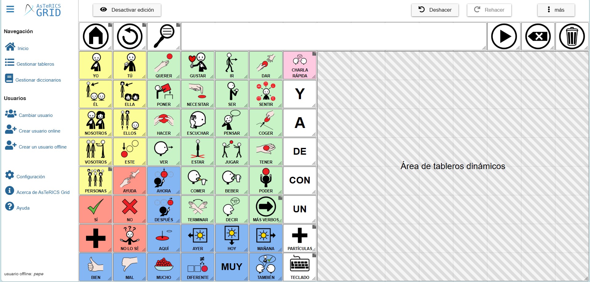
By disabling global grid editing, we see how the Dynamic Grid placeholder that we had defined loads the Home grid.
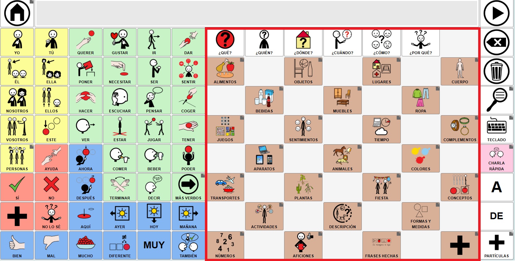
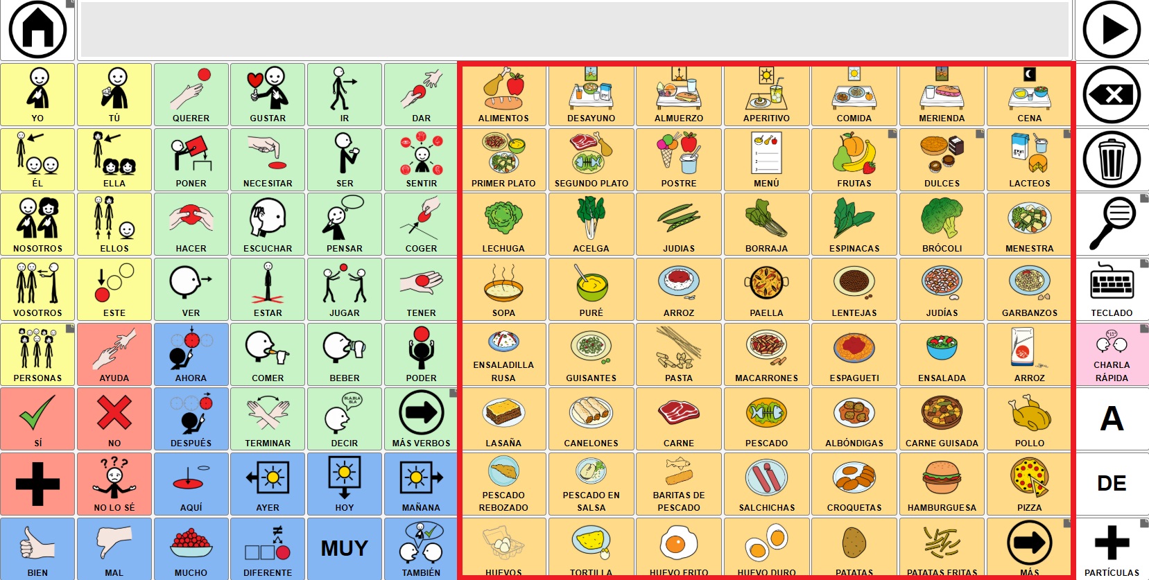
If we click on any of the categories such as “Food”, the grid loads in the same area without modifying the rest.
CREATE THE DYNAMIC GRID PLACEHOLDER
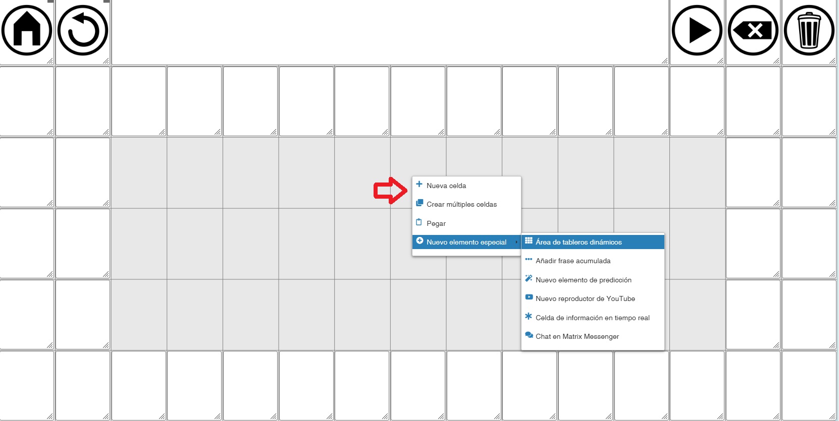
To create the dynamic grid area, right-click on the cell where you want to place the area. In the options, choose New Special Element -> Dynamic Grid placeholder.
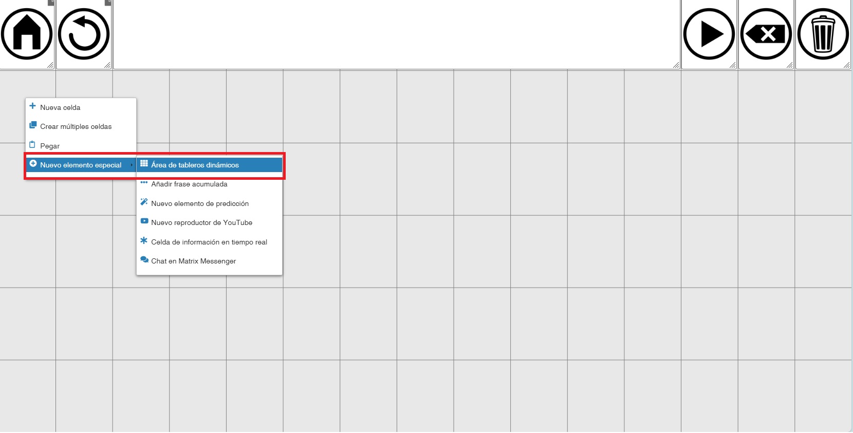
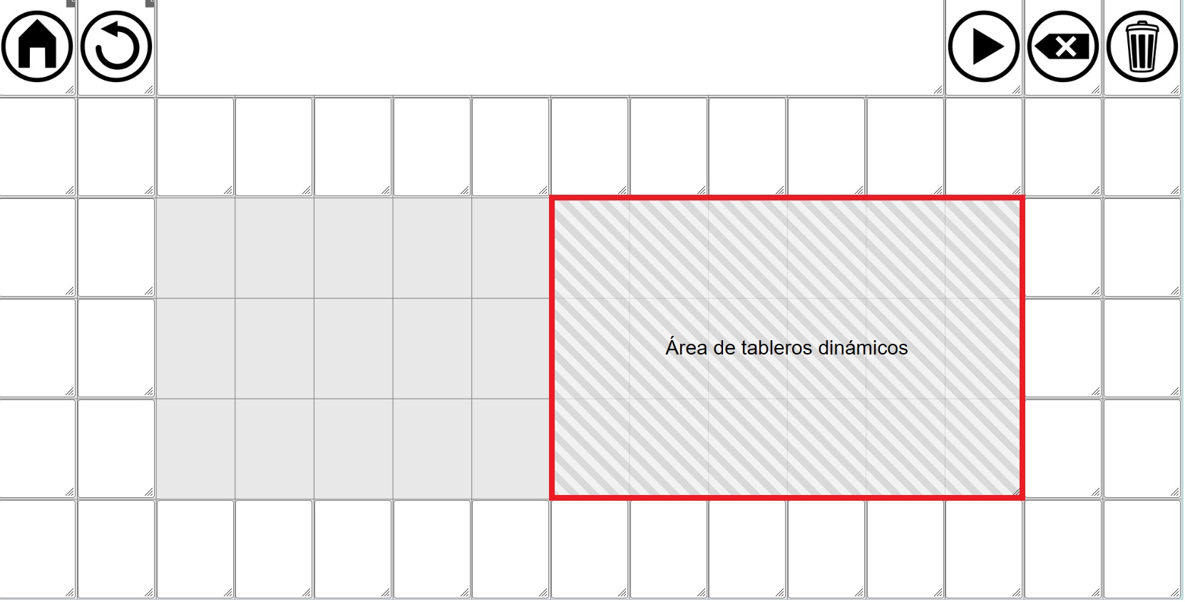
(IMPORTANT) The placeholder will always be rectangular and will always be created starting from the cell where we clicked, to the right and down, occupying the available empty cells.
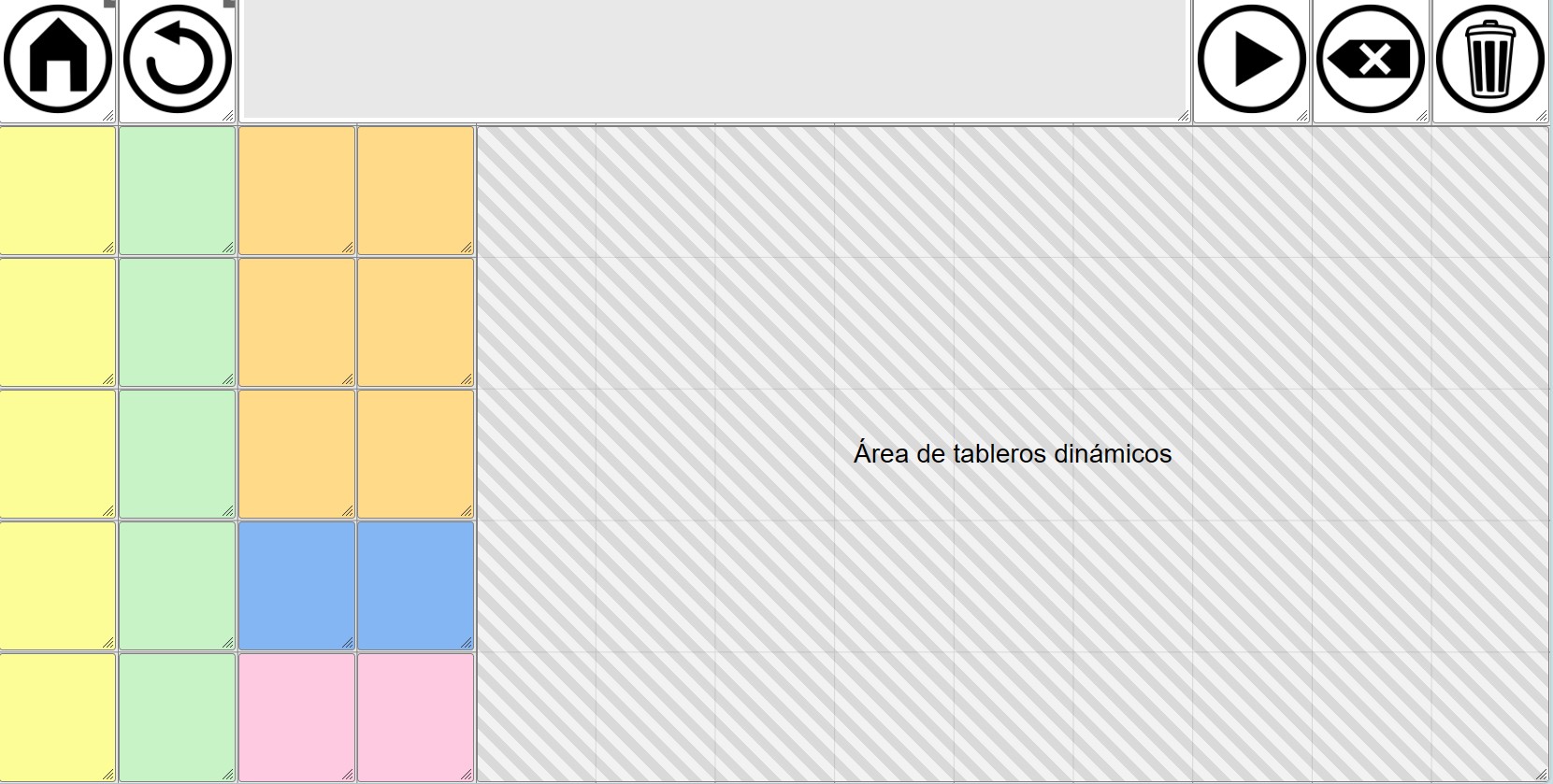
To illustrate, we added blank cells to the previous model and left an empty area in the center of 3 rows x 11 columns.
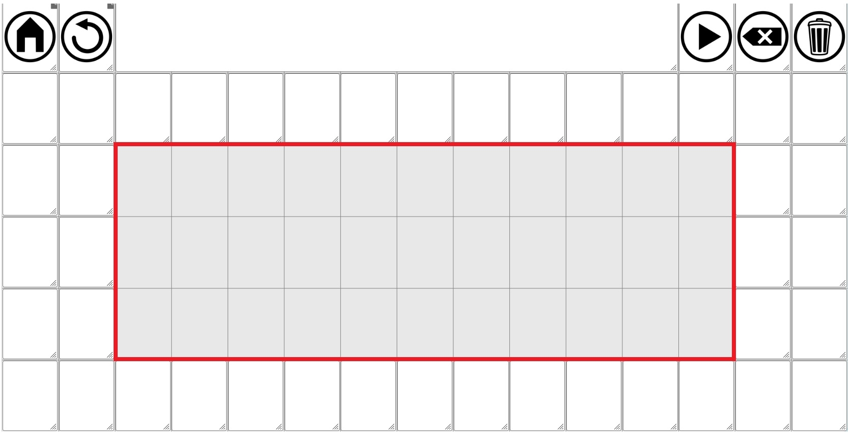
We right-click on the cell marked with the arrow.
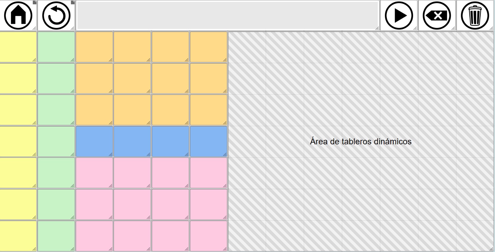
The result is that the placeholder is created from that cell to the right and downwards, occupying the space that was left empty.
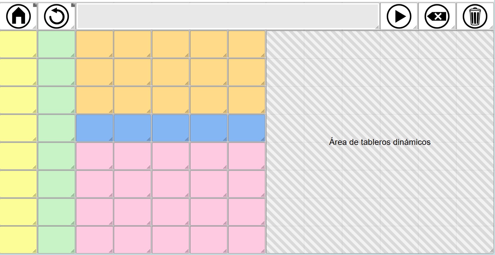
 The Dynamic grid placeholder, like other cells or areas such as the YouTube area, can be resized. To do this, click on the bottom right corner and drag while holding down the left mouse button until you reach the desired size.
To move it to another location, click anywhere in the placeholder and, without releasing the button, move it to another empty area of the grid.
DESIGN OF THE GLOBAL GRID AND THE DYNAMIC GRID PLACEHOLDER
The flexibility offered by the Dynamic grid placeholder when designing our communication tool requires us to carefully consider how we want to organize it. This is crucial because decisions such as the size (number of rows and columns) of both the home grid and the individual boards (the dynamic boards) will depend on this initial planning.
Broadly speaking, we can consider three types of organization of the global grid and the communicator:
1- GLOBAL GRID: FIRST ROW WITH ACCUMULATED PHRASE AND CONTROL BUTTONS + DYNAMIC GRID PLACEHOLDER
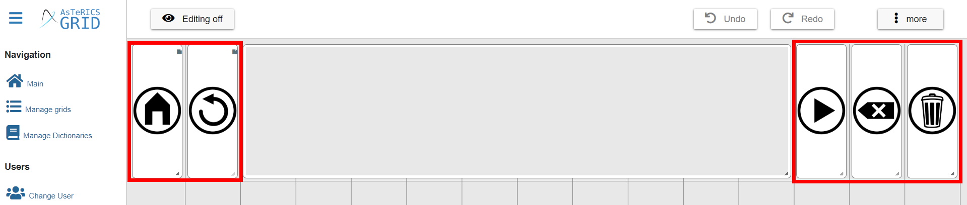
This is the most basic organization, the one we’ve already seen in some screenshots. This is also the default global grid layout that loads when we click on Reset Default Global Grid within Manage Grids.
In this model, as we can see, the first row is occupied by the accumulated phrase and the various communicator control buttons (home, back, read phrase, delete last word, and delete phrase). The next five rows are occupied by the dynamic grid placeholder, which is created by default and fills all the empty space.
In this model, as in the others we’ll see below, the key is knowing the number of rows and columns that the dynamic grid placeholder occupies. In this one, by default, it’s 5 rows x 15 columns.
If we want our dynamic grids to have the same size (width/height) when loaded in this area as, for example, the home, back buttons, etc., the boards we create will have to be 5 rows x 15 columns.
Based on this default design, if we want our dynamic grids to have 6 rows, we will add one more row to the global grid…
…and expand the dynamic grid placeholder.
Just as we’ve added another row, we can add more columns or reduce the number of columns or rows. The most important thing is that the dynamic grid placeholder has the dimensions (rows and columns) that we want the grids to have when they load in that area.
(TRICK) If we reduce columns, we will also have to reduce the space occupied by the accumulated phrase so that the grid is reduced to the columns we have defined.
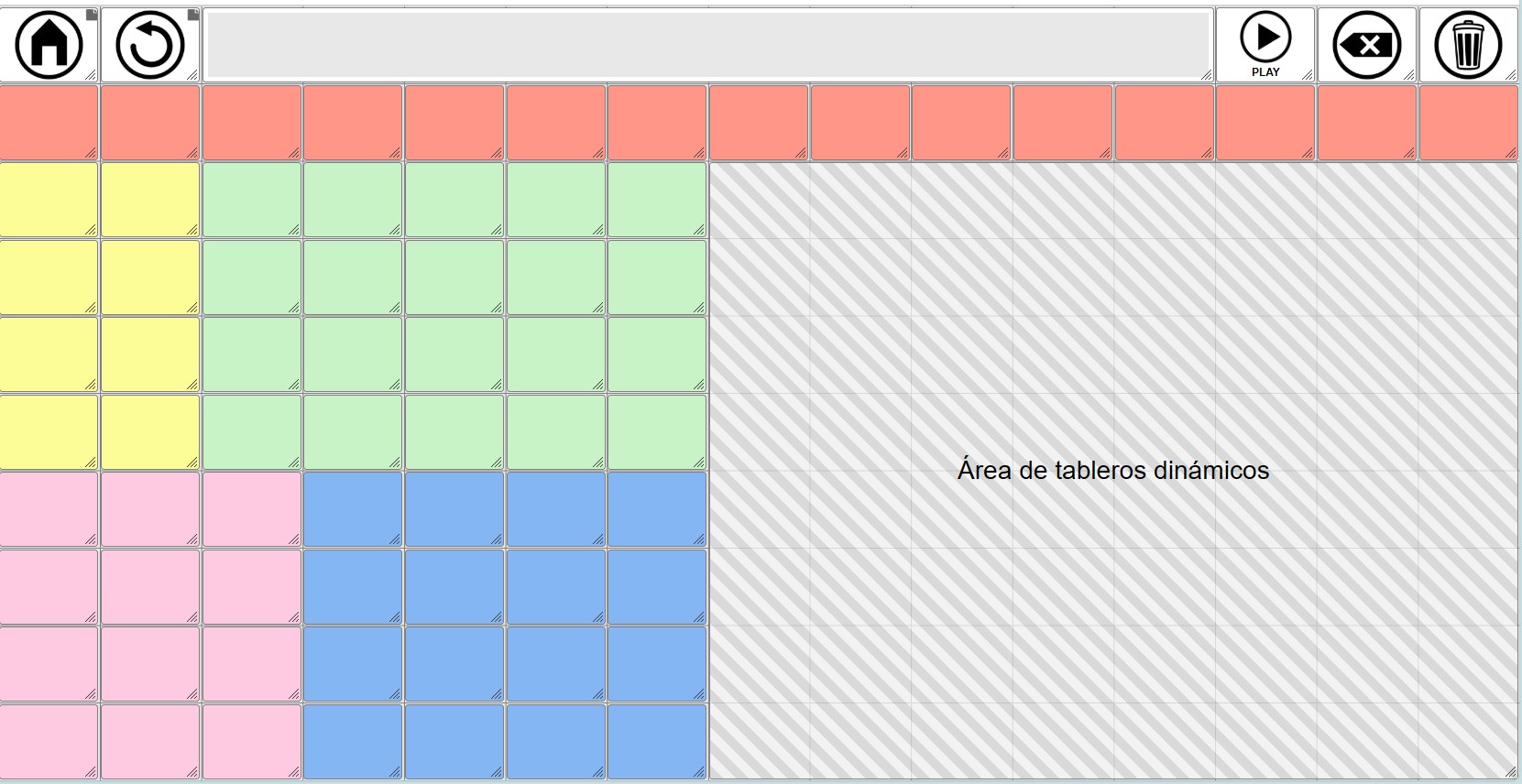
If we don’t mind that the cells in the dynamic grids are a different size than the buttons on the global grid, we could create grids with different dimensions. In the example below, we see that the size of the cells in the first row doesn’t match those in the second row, which are already part of the initial dynamic grid.
2- GLOBAL GRID: FIRST ROW WITH ACCUMULATED PHRASE AND CONTROL BUTTONS + CORE VOCABULARY
In these models, unlike the previous one, we will use not only the first row of the global grid but also some of the rows and columns below it to have core vocabulary that will be permanently displayed in the communicator and define a dynamic grid placeholder on which the rest of the grids will be loaded.
Here, as in the previous model, it is very important that we do a prior planning exercise to design our communicator and define how many rows and columns we need for the core vocabulary and how many for the dynamic grid placeholder.
The design possibilities here are numerous. We’ve included screenshots of some possible layouts for the global grid with the dynamic grid placeholder inserted. When designing both the global grid and the dynamic grids, it’s important to pay attention to the row and column dimensions we’ve provided.
As we mentioned in the previous model, in order for the cells of the dynamic grids to have the same dimensions as the cells we create in the global grid, the dynamic grids will have to have the same number of rows and columns as the dynamic grid placeholder.
Core vocabulary (6x5) - Dynamic grids (6x8)
Core vocabulary (5x4) - Dynamic grids (5x9)
Core vocabulary (7x6) - Dynamic grids (7x7)
Core vocabulary (8x7) - Dynamic grids (8x6)
Core vocabulary (8x7) + Second row + Dynamic grids (8x8)
Core vocabulary (8x7) + Last row + Dynamic grids (8x8)
You can download backup copies of these blank communicator models from this page of the manual.
Regarding these possible models, as we have mentioned, the design possibilities are numerous.
The most important thing is to make a preliminary design in which we outline the dimensions of our global grid, establishing the total number of rows and columns it must have to accommodate the first row, the core vocabulary, and the dynamic grid placeholder.
The dimensions (rows and columns) of this dynamic grid placeholder must be the same as those of the dynamic boards we create, if we want to maintain an identical appearance for all cells.
If we don’t mind that the cell size of the dynamic grids matches that of the global grid, we can create dynamic grids with any number of rows and columns. The system will always adapt the grid to display within the area we’ve defined in the Global Grid, even if this means making the cells larger or smaller.
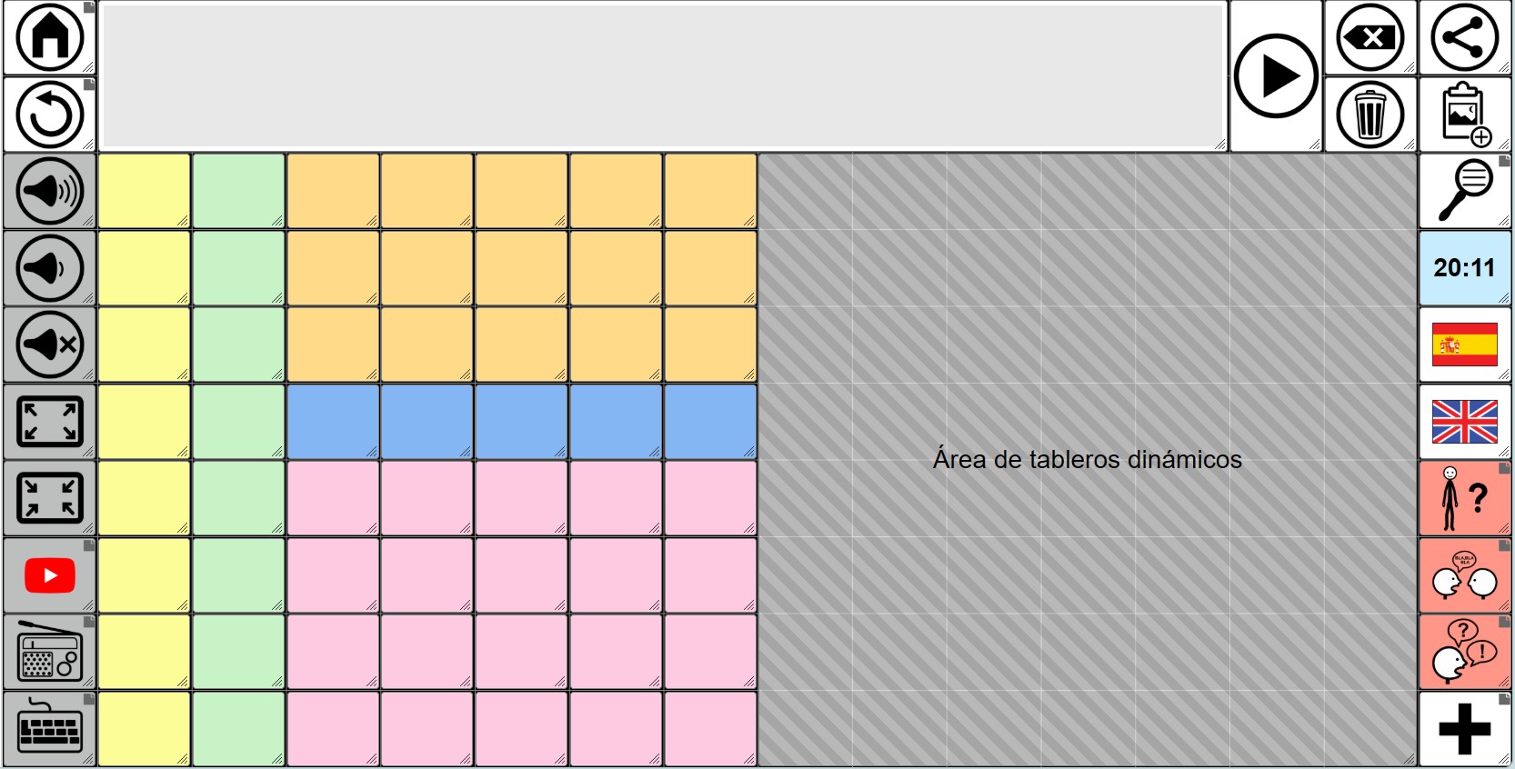
3- GLOBAL GRID: FIRST ROW WITH ACCUMULATED PHRASE + CONTROL BUTTONS IN THE SIDE COLUMNS
This third model can complement the first and second models. In it, we will place communicator control buttons and other types of cells in the first and last columns, as well as expand the accumulated phrase area to two rows.
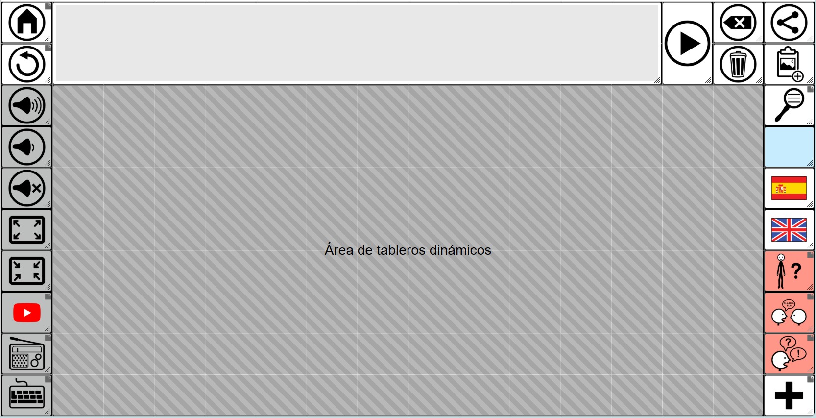
As you can see in the first column, the navigation buttons (home and back), the buttons to control the device’s volume (up, down and mute), the buttons to enter and exit full screen from the browser itself, and the buttons that give access to the YouTube, Radio, and keyboard grids have been placed.
In the second-to-last and third-to-last columns are the Play button to read the sentence and the buttons to delete the last word and delete the entire sentence.
In the last column, from top to bottom, we’ve arranged the buttons to share the phrase as an image on social media or apps like WhatsApp, the button to copy the phrase as an image to the clipboard, and the button to search for words in the communicator. Below that, we’ve added a real-time information cell (blue) that displays the current time. Below that are two buttons to switch between Spanish and English, since in this example we’re assuming it’s a bilingual communicator. Finally, there are buttons to access grids with vocabulary about myself, for speaking with another person, set phrases, and more vocabulary.
Of course, this is just a hypothetical example that serves to show some of the possible buttons or cells that we could place in those side columns.
In the center is the dynamic grid placeholder with dimensions in this case of 8 rows x 14 columns.
In this model we have not included core vocabulary, but we could easily modify and add it.
If we add vocabulary, we would have to reduce the dynamic grid placeholder and also adjust the size of the dynamic grids to match the new dimensions (rows and columns).
Of course, we could create any combination we want based on these basic models. As we’ve mentioned, the flexibility is maximum, allowing us to adapt to different designs and needs.
ACCUMULATED PHRASE
We are going to add the cell for the cumulative phrase, where the symbols and texts are added for later reading with the synthesized voice.
To do this, we can right-click on one of the cells and the menu will appear, where we must select New and New collect element. You can also add it using the More button at the top right of the grid as shown in this screenshot.
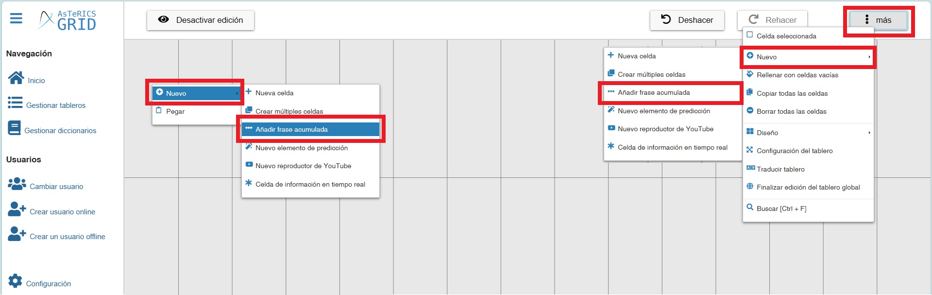
Once this option is selected, the cell of the cumulative sentence appears, which we can stretch to make it larger and move it to where we are interested in. We recommend that the elements you place on the global grid be located in the first row of cells.
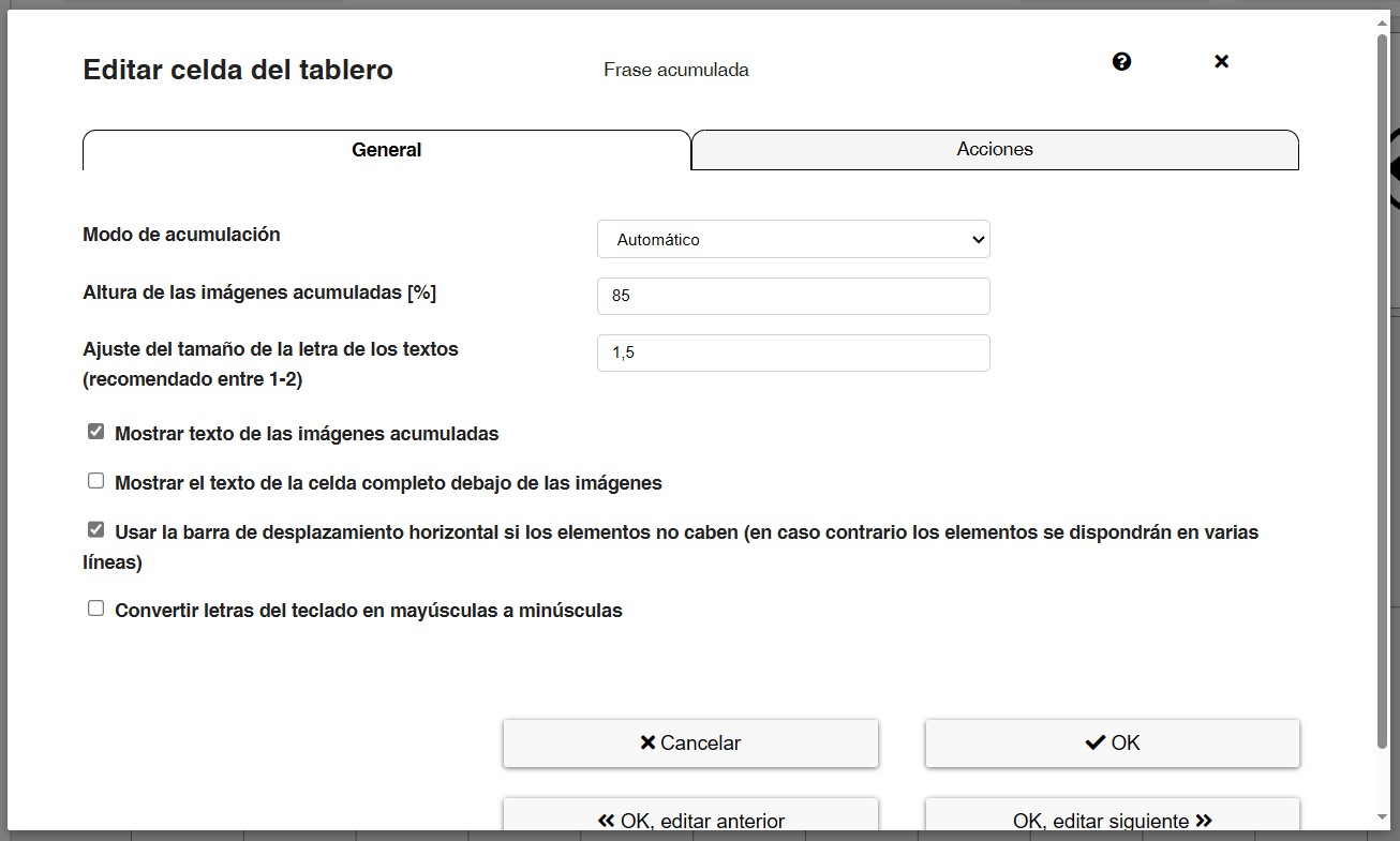
To Edit tand Configure the cumulative phrase (collect element), right-click on it. As we can see we have two tabs: General and Actions.
We recommend that you use the default configuration, but you can test to familiarize yourself with this window.
However, we briefly explain the different options.
In the General tab we can set:
- Collect mode: we can accumulate all elements together (symbols and texts written on the alphanumeric keypad board) or only accumulate texts (for people who exclusively use the alphanumeric keypad). We recommend that you use the Automatic mode on a regular basis. In either case, the synthesized voice will read the symbols and texts.
- Height of collected images: indicates the percentage that we can select to make the images fit the size of the accumulated sentence.
- Factor for font size of only-text elements in separated mode: (recommended between 1-2).
- Show labels of collected images: allows you to select whether the text you have entered in the cells of the images and symbols should appear or not. We recommend the first option. Occasionally it happens that the text is larger than the pictogram and appears choppy. We can use the previous option to adjust the font size.
- Show the full text of the cell below the images: allows you to select whether you want the text to be displayed in full below the images or to be cut off and ellipses added if the text is longer than 8 characters. By default, this option is deactivated to maximise the number of images displayed in the visible space of the accumulated sentence, but it may be interesting to activate it if, for example, we want the user to read the compound sentence in the accumulated sentence.
- Use horizontal scrollbar if elements don’t fit: if the user is accumulating more elements than fit in the accumulated sentence, a scroll bar will appear at the bottom if we activate it. If this option is not active, the elements will be arranged in multiple lines.
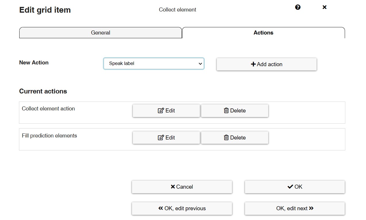
In the Actions tab, we can set any type of menu action that will be executed when we click on the collect element.
In this case, it is interesting to have activated those that you can see in the following screenshot: Collect element action and Fill prediction elements.
In the case of Collect element Action, we recommend using any of the first four actions:
- Speak collect element content (separately – element by element): the synthesised voice speaks the whole sentence element by element, highlighting the pictograms and texts with a green background box.
- Speak collect element content (continuously): the synthesised voice speaks the whole sentence continuously, without pauses.
- Speak collect element content (separately – element by element) and clear afterwards: the synthesised voice pronounces the whole sentence element by element, highlighting the pictograms and texts with a green background box. Once the phrase has been spoken, it will be automatically deleted.
- Speak collect element content (continuously) and clear afterwards: the synthesised voice speaks the whole sentence continuously, without pauses. Once the phrase has been spoken, it will be automatically deleted.
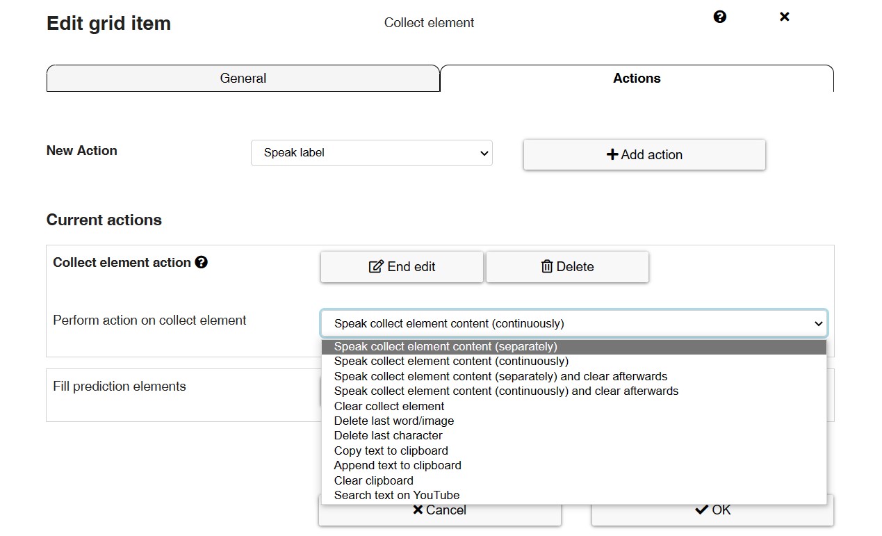
These actions work completely independently of the actions we have set for the Play button. For example, we can play the phrase element by element by clicking on the cumulative phrase box (collect element) and we can play the phrase continuously by clicking on the Play button.
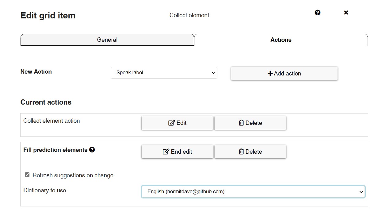
In the case of the action Fill prediction elements, word suggestions will appear as you type on your alphanumeric keyboard, as explained in tutorial 11 – Actions – Creating an alphanumeric keyboard with prediction elements.
We can configure this action in general from this section, although we must have chosen a dictionary beforehand, as explained in the tutorial mentioned above.
Cumulative phrase Action Cells
Now, let’s add the cells with different actions of the collect element (cumulative sentence). This is an example. In your case, you can distribute the elements in the order that is most appropriate for your user.
To enter the action cells for the cumulative phrase, first create a New cell by right-clicking on it or from the upper right button More.
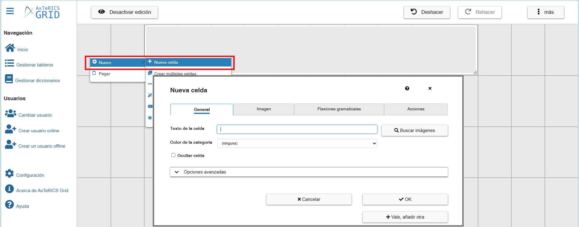
As usual, the cell editing window is shown. As they are action cells, we can leave the Text unfilled.
Before entering the image, we must select the Action we are going to enter for our cumulative phrase (collect element).
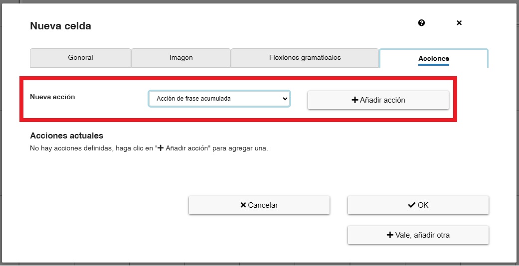
In this window, select Collect element action and click on Add action. As we can see, there are several actions, although it is not necessary to enter all of them, but only those that the user will actually use.
In the following example, we are going to enter the cell that is going to perform the action of Speak collect element content action that will be performed by the synthesised voice when we click on this cell.
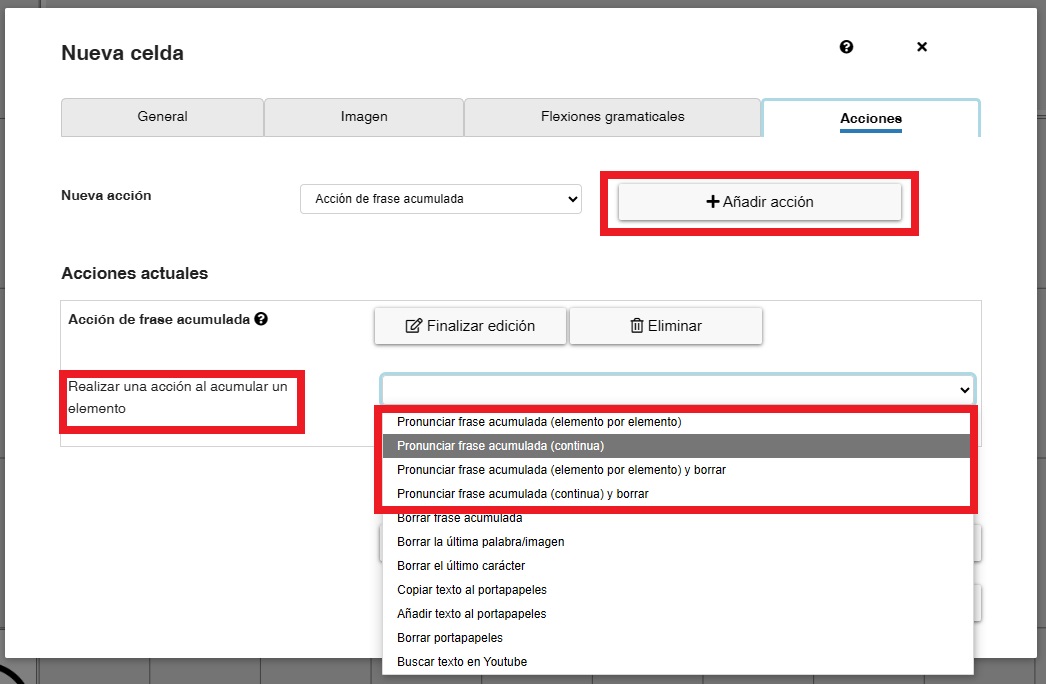
As we can see, there are four options when it comes to pronouncing the cumulative sentence:
- Speak collect element content (separately – element by element): the synthesised voice speaks the whole sentence element by element, highlighting the pictograms and texts with a green background box.
- Speak collect element content (continuously): the synthesised voice speaks the whole sentence continuously, without pauses.
- Speak collect element content (separately – element by element) and clear afterwards: the synthesised voice pronounces the whole sentence element by element, highlighting the pictograms and texts with a green background box. Once the phrase has been spoken, it will be automatically deleted.
- Speak collect element content (continuously) and clear afterwards: the synthesised voice speaks the whole sentence continuously, without pauses. Once the phrase has been spoken, it will be automatically deleted.
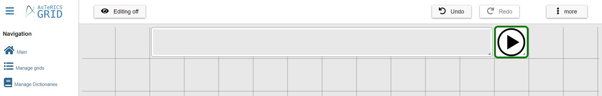
In the Image tab, in ARASAAC we can find a collection of action buttons, which you can use in this case. To view them and assign them to the cell, just go to the Image section and type the word button in the Image search field. For the action of read the sentence, we have selected the Play button.
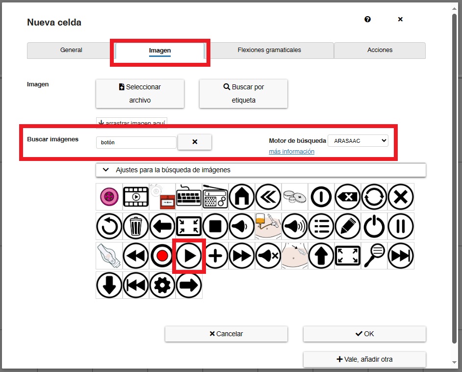
Click on OK and we have our first cumulative phrase action cell.
Now you can continue to insert the most frequent cells that the user will use, such as Delete last word/image or Clear collect element. The process is the same as the one used to pronounce the phrase. We choose the icon and associate it with the corresponding action.
We recommend that you edit the default cells to understand how each one works.